Page 1 of 1
Portals test
Posted: Thu May 22, 2008 1:57 pm
by phile_forum
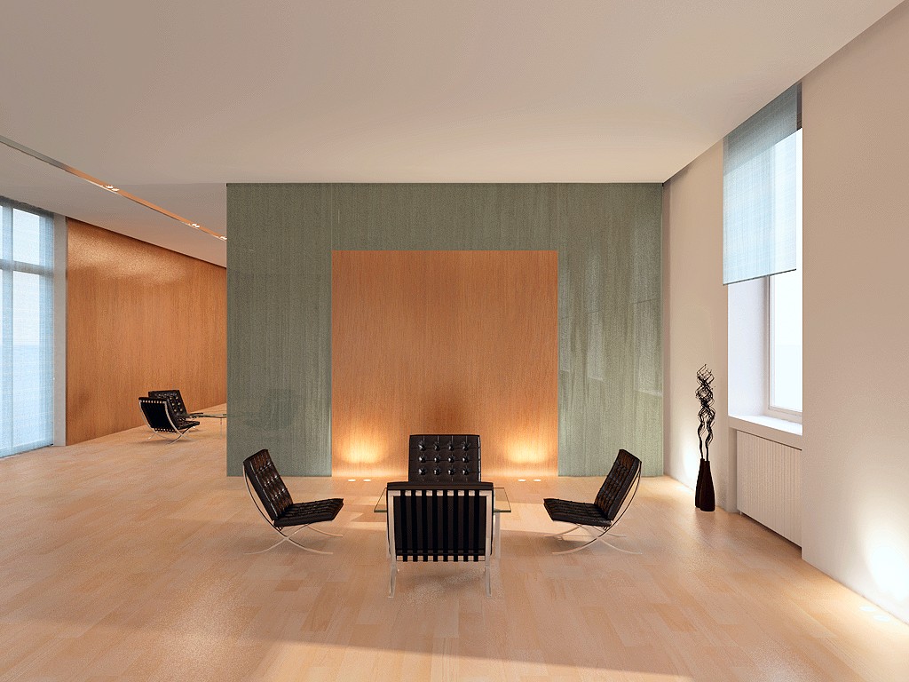
Thanks for the help with portals yesterday. This is a scene I keep going back to when I want to test something new. Just over 14 mins on my 2.4GHz quad core. Some colour balance, gamma correction and sharpening in post.
Can't attach, so you can see it
here.
Phil
Posted: Thu May 22, 2008 3:44 pm
by geo_n
The room looks like its self illuminated. How does it compare to f9 or fprime? Did you use kray specific materials? Just asking because the material looks like emmiting light. I'm new and trying to figure out how to setup materials.

Posted: Thu May 22, 2008 9:13 pm
by jure
The light is not bad but surfaces definitely need some tweaking.
For best results i suggest linear workflow (read about it on wiki in tutorials section).
Posted: Thu May 22, 2008 11:05 pm
by phile_forum
geo_n wrote:The room looks like its self illuminated. How does it compare to f9 or fprime? Did you use kray specific materials? Just asking because the material looks like emmiting light. I'm new and trying to figure out how to setup materials.
No idea about fprime - I'm probably the only LW user who doesn't have it.
As for the materials, they certainly aren't emitting any light. As Jure says, I need to investigate colour management, but the materials are otherwise pretty standard. The golden rule is to make sure that (r,g,b)*diffuse+reflection<=100%. One thing I find is that matt-painted surfaces like walls often benefit from a small amount (eg 1.5%) of highly blurred reflection.
Jure: thanks for the wiki link. I'll take a trawl through that and see if I can't get my head around the subject!
Phil
Posted: Fri May 23, 2008 7:04 am
by larry_g1s
I agree with some of the comments, but one of the things that struck me about the render was that I really like the color choices. So agreed about the texture tweaking and such, but the colors are a really nice combo.
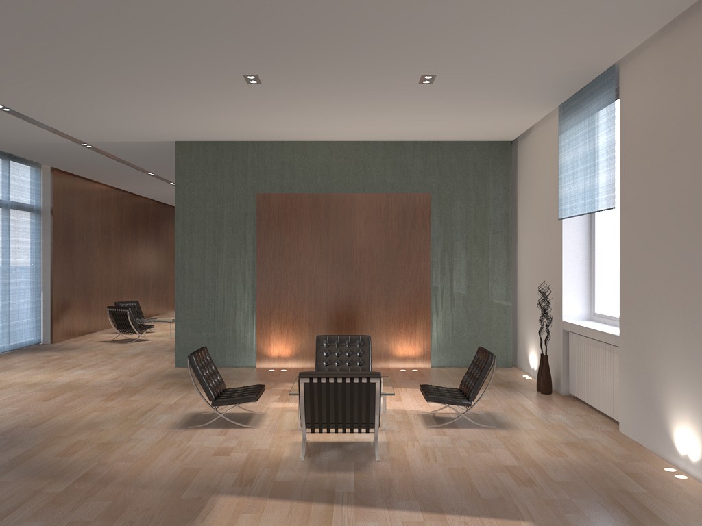
Posted: Fri May 23, 2008 4:52 pm
by phile_forum
Here's an update with a few lighting & render quality tweaks, and the whole thing rendered via a linear colour space (AdobeRGB 1998 - I had a look at sRGB but couldn't work out how to linearise that one).
Only postwork is a bit of sharpening.
Phil
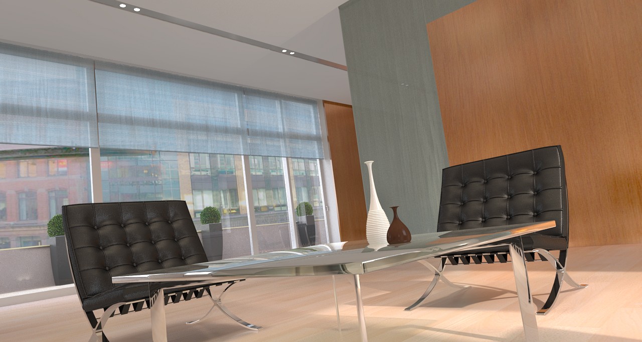
Posted: Fri May 23, 2008 10:35 pm
by phile_forum
And
here's a slightly more interesting angle.
Posted: Fri May 23, 2008 11:19 pm
by jure
Lookin much better phile! keep tweaking those chair surfaces.
Posted: Sun May 25, 2008 3:43 am
by geo_n
lighting looks really good. I think the saturation level went down too low. Was it done in post?
Posted: Mon May 26, 2008 2:28 pm
by phile_forum
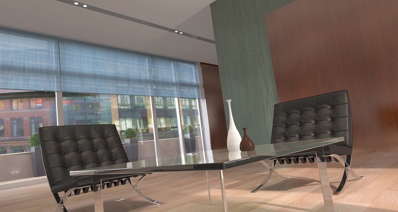
OK, I think I've spent enough time on this now!
Here's the final version (until I decide to fiddle with it again). Slight saturation boost and sharpening in post.
Phil
Posted: Mon May 26, 2008 2:39 pm
by jure
Cool! Looks pretty good now. I see some smoothing problem on the tables chrome part - maybe smoothing is too high?
Posted: Mon May 26, 2008 3:03 pm
by Janusz Biela
this is much better , but still bad contrast....
Try SG_CCFilter + lower bounce ( I mean recurse 8;)
Posted: Tue May 27, 2008 5:50 pm
by phile_forum
Yeah, the contrast was bothering me a bit too. I was already using SG_CCFilter, but I reduced bounces from 16 to 8 and
this is the result.
Some brightness/contrast & saturation adjustment in post, Also sharpening.